Updates / News /


Updates / News /


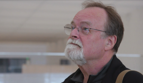
As the grand reopening of the Museum of the Gateway Arch draws near, we sat down with design director Bill Haley to chat about the process, the challenges and the highlights of the museum creation. Haley is founder of UK-based Haley Sharpe Design, which has consulted on museums all over the globe, including the Smithsonian’s National Air and Space Museum and National Museum of American History, Stonehenge and the Harriet Tubman Underground Railroad Visitor Center.
Gateway Arch Park Foundation: How did you get into museum design?
Bill Haley: I knew I could draw and had a feeling I wanted to do design, so I went to art school. I returned to Edinburgh, where my mother was from, for my first job – I was the first museum designer they ever had at the Museum of Edinburgh. You never stop learning in this job and I love getting to tell other people’s stories.
GAPF: You describe the layout of the museum like a magazine, which allows visitors to take in as little or as much of the experience as they’d like and still get something out of it. Tell me more about that approach.
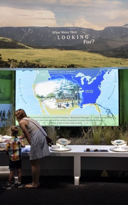
BH: Each of the six exhibits has a central feature that will resonate even if you’re just quickly walking through. These hubs were critical because they represent key events that happened in St. Louis, so you’re walking through the history that happened right here. This makes it especially special for the local community. The supporting exhibits allow visitors to take a deeper dive if they’d like. For example, we include personal stories about interesting people who lived at the time, including minorities and children. So we’re telling the big-picture history alongside the history of the people who lived it.
GAPF: What makes this museum unique?
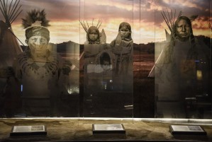
BH: This is about the landscape and people reaching beyond the known world looking for their personal frontiers in these unknown landscapes. To that end, each exhibit features a landscape of some sort. We view our job as making history relevant to modern audiences. By telling individual people’s stories, we show that people had the same desires 200 years ago, whether it was to build a successful business, self-improvement, etc. For example, one video features a young Native American girl talking about history and how it’s relevant to her today. It shows visitors that history isn’t just about old people but rather continues to impact people in the here and now.
GAPF: Walk me through the design process – where do you start?
BH: We started with the long-range interpretive plan the National Park Service produced. For six months, we listened to National Park Service historian Bob Moore. We really come at it as professional visitors – we don’t know the story and get to explore it with no preconceived notions. As outsiders, we have great freedom to ask questions about the history. We also worked with a copy specialist and copy editors to develop a common language. We visited the Lincoln Home National Historic Site, Cahokia Mounds and other local historical sites to develop an understanding of what they liked and disliked as well as what media they liked or disliked.
Our job is to find the essential quality of the story. Jefferson had an intellectual concept of the country as a grid which shaped the nation, so we quickly came to the concept of people doing things in landscapes. You also have to decide on the best approach to tell the story. Here we took a variety of tacks: expressionistic, which poses questions to the visitor, aesthetic, and immersive, which puts people in locations. I always equate this decision with choosing a director for a film. Different directors produce very different results.
GAPF: Are there any special technical considerations that went into the design?
BH: We have four settings for lighting and sound – for when the museum is crowded, when it’s a little busy, when it’s quiet and one for when we have groups of visitors who are sensitive to light, color and sound. We consulted heavily with Universal Design Group to make sure the museum was accessible and enjoyable for all groups.
The lighting is always a fascinating part for me, as well. It can create a sense of time, place or feeling. With filters, you can take the harshness off or create certain effects. For instance, the lighting on the Old Rock House replica is meant to look like moonlight.
GAPF: How will you feel on the day of the grand reopening?
BH: I’m excited to watch people walk through the museum. I get a lot of pleasure in seeing people react – some react exactly as I suspected they would, and others find a completely unexpected way to experience the space.

St. Louis has always been a city that knows the warmth of community during this time of year. YOU can continue this legacy by joining our mission to uplift our great city and its hometown national park.
JOIN TODAY to enjoy a host of member benefits and the good feeling that comes from being a part of history and enriching the lives of more than two million annual visitors and guests to downtown St. Louis.